Responsive Web Development
Responsive Web Development and Online Marketing since 2008. Web Developer with responsive website design experience.
Responsive Web Development
Responsive Web Development is a requirement nowadays. Whether a simple small business website, an e-commerce one or an AMP, all websites must be responsive! This is due to the new devices and resolutions that continue to emerge, so building a compatible and presentable web page should be a priority. Hence, Web Developers no longer choose from designing for specific browsing environments over others. Responsive websites allow all customers to be reached. After all, a poor experience on a device will only result in a customer being lost.
Responsive web design (RWD) refers to responsive web design development and focuses mainly on front web development. RWD is an approach to designing for many devices customers use, ranging from tiny phones to huge desktop monitors. The system allows website designers to create dynamic web pages and websites that change based on the screen size and orientation of the device used to view it. Nowadays, all web developers need to ensure that the websites they build are responsive and aware of the web development process.
Grids combined with CSS
The application of Responsive Web Development utilizes versatile images, layouts, and grids combined with CSS. Cascading Style Sheets help developers change the appearance of a web page design no matter what device is used to view the digital content. Users can seamlessly view the same website from desktops, tablets, or phones. Their viewport size and orientation determine formatting conditions.
Developers write the code to respond to the user’s environment, eliminating generating multiple designs for each device.
You might think smartphone web design is a newer invention; however, it has been around since web browsing was possible on mobile devices.
You may not know, but various devices and display technology allow users to browse multiple screen sizes. Some devices provided the ability to switch between landscape or portrait orientation quickly. Others were fixated on a specific view. The ever-increasing trend proved challenging to keep up with at first. Images frequently broke page layouts. Landing pages would be difficult to use or read. Forms were unbearable to fill out. Potential customers got frustrated with the poor appearance or functionality and left the web pages.
Dynamic image flexibility and design techniques on content emphasis gradually emerged to allow developers to design one page with multiple viewing options, even on different devices.
New Website
We create individualized custom website designs that allow businesses to expand. Our carefully crafted websites are developed with a purpose and goal: MORE CUSTOMERS!
Website Maintenance
Suppose your website is outdated and not meeting your customer's needs. We will re-design and develop a functional, attractive website with a "wow" effect. In addition, we advise on website content.
Online Marketing / SEO
You have a website, but it's not getting traffic or has limited online visibility. Our proven SEO strategies will enable your website to rank higher and generate sales.
We focus on customer relationships and success-based solutions.
Our services include understanding competition and creating individualized strategies for each customer.
VisualWebz LLC, a Leading Agency for Excellence in Web Services

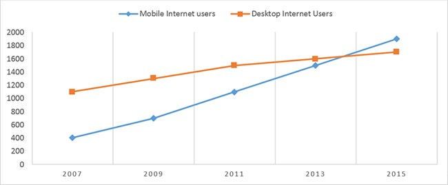
Smartphone Usage has outgrown desktop browsing.
Smartphone and mobile device use has grown to outpace traditional desktop browsing. People are using handheld devices to research and check businesses more often.
But Google isn’t the only company paving the way for responsive web development. Google has pushed developers to be mobile-friendly by ranking mobile-optimized separately from desktop searches. Google released this helpful tool (“Is Your Web Page Mobile Friendly?”) to help you test if a site is mobile-friendly.
Grid/Card UI’s
The Grid/Card UI’s attributes fit well with mobile-first and responsive design ideologies. Intended primarily for mobile users but can also scale up quickly to large screen sizes. The Card UI will be a dominant implementation for some time to come. What exactly can we do with all of these up-and-coming developing responsive web technology now? Conceptually, responsive web design is a relatively simple idea, and it can effectively make a website much more user and device-friendly. However, this all depends on whether or not it is correctly implemented via HTML 5 and CSS.
To begin with, certain elements and variables need to be identified to determine which methodology is required to implement responsive web design. A good start is deciding what devices are on the market and how many different aspect ratios you intend to support.
Responsive web design should adhere to four separate categorizations based on general dimensions. These are smartphones, small laptops and tablets, full-sized laptops, and computer monitors. Some overlap, such as larger smartphones on the market, usually referred to as phablets or full-sized notebooks and desktops. The separation between these general dimensions is referred to as breakpoints.
Coding – Responsive Web Development
To avoid potential difficulties, simplifying the website and limiting embedded content such as pictures, videos, and background graphics can ease CSS coding for responsive web design. Another thing that can make the process less arduous is minimizing redundancy, although good coding should take care of this.
Coding Methods & Tips
As for specific coding methods, tips, and strategies for implementing responsive web design, that way, rather than the page consistently loading a header photo that’s 50px X 200px, you can set it as something like “IMG { max-width: 100%; }”, with percentage varies depending on how much space you intend on using.
This way, when the webpage detects the display size, it can shift elements according to the display size while keeping the general appearance of percentage-sized elements. This doesn’t work for everything because some devices can vary so much in size, so you may have to use different sizes to fit other devices.
HTML5
Another method that works well for navbars and things like that is using inline html5 and if-else statements to establish different ranges of aspect ratios that can decide how large each webpage element might be. For example, something along the lines of “ if(max-width == “500px”) document.getElementById(“other”).setAttribute(“style”,”width:200px; height:100px”); else document.getElementById(“other”).setAttribute(“style”,”height:20%; width:85%;”); “ This can be useful when you want the website to show up a certain way on your primary source of traffic in terms of devices, and a different way on any other potential site viewers.
Relative Placement
Another helpful tip is using relative placement rather than fixed placement. Depending on the device display, the web page contents will be much easier to shift around. The easiest way to do this is to pick a parent element and have the rest of the web page’s contents arranged depending on the placement you determine. Again, using percentages is helpful so that the arrangements you want to remain the same with the parent element will do just that.
Although responsive web development is highly convenient and does have its uses, it comes with drawbacks and is not always a fix-all solution. Like most solutions to problems, responsive web design is situational, and its effectiveness is determined by the websites and the visitors’ needs.
Why responsive design
You would want to use responsive web design on the positive spectrum for many reasons. Reduced time spent developing the site means that payments issued to employees won’t be as much if they make hourly wages. Also, it potentially requires fewer people to build the web page because instead of having two teams working on separate websites, you could have one group complete the responsive web page.
Responsive Design is Cheaper
Responsive web design is a cheaper and possibly more efficient method of developing web pages. Building on the concept of only one URL being necessary, no redirects are required after loading the web page, and you will always be taken straight to the homepage after clicking the link. Again, since it’s only necessary to create one web page with responsive web design, the website’s SEO ranking will be improved by a lot since that particular site will accumulate all potential web traffic rather than collect them separately based on the mobile, desktop, and tablet versions of the website. As we all know, better SEO results in more traffic, and more visitors are always better.
Negative Aspects of responsive design
As for the negative aspects of responsive web design, there are fewer, but the individual cons are much heftier than most of the pros mentioned earlier. To begin with, responsive web design might not always be a viable solution for different websites. If the needs for mobile devices versus the requirements for desktops and larger devices vary by too much, creating a comprehensive website will be too difficult, and fulfilling the different needs of devices won’t happen effectively. Another issue is that websites with much-embedded content to load won’t work well on mobile devices.
Optimizing for load speeds
Since responsive web design resizes things to fit the dimensions of the display, it takes about the same amount of data to load the web page on a smartphone as it does on a desktop. This can result in long load times, and sometimes images and other embedded content won’t even load if the mobile connection isn’t good enough. Another issue is that responsive web design can take longer and require more effort and intense coding to get the site to load correctly on different devices. This isn’t always the case, but it’s a precaution that must be acknowledged before jumping into a project where you plan on using responsive web design.
Finally, responsive web design is essentially just a compromise between mobile and desktop devices- meaning you are expected to lose some functionality for each device’s web page. Making separate web pages for mobile and non-mobile devices makes it possible to specialize in the web page for each device. Thus, making the content can specifically be tailored to specifications and uses. With this knowledge, we can advance into an utterly immersive web experience.
The future of Responsive Web Development
The future holds so many possibilities. Consumers are more supportive of a brand if they consume content from it. Beyond the simple viewing of an ad, interactive websites that engage consumers with their brand have seen returns on that investment by increasing loyalty and favorability. Due to this, more companies can be expected to focus on customer experience.
Realizing virtual reality and Artificial Intelligence potential is on the horizon as well. Still, in its early adoption phase, VR technology can offer an immersive experience never perceived before. Developers are only beginning to comprehend the implications of web browsing. It won’t be long with motion-capturing input until fully interactive web pages begin enticing users. Other possibilities could be in website colors, where custom websites could pop up based on user preferences. Imagine if a visitor’s favorite color is purple; they’d be more inclined to stay on the website.
For the time being, it just makes sense for webmasters, small businesses, and website owners to consider essential web design tips that ensure they are in line with customer expectations. Of course, web design history has only shown that things can change suddenly with the possibility of introducing new devices.
Delivering Effective Web Design & Online Marketing Services
Local Web Design Services for Small Businesses
You've come to the right place if you're looking for web design, website development, a new website, or a need to revamp an existing small business website. We understand business owners, and the website benefits your business needs. Besides, we know that being a website owner. You will want to see immediate results.
Furthermore, we can help your website reach an international, national, or local customer base. Besides, we know how to get your customers to you. After all, small business website development and SEO know-how are our specialties!
Our customers continually praise our web design services.,check our reviews!
We Deliver Effective Web & SEO Services
Our website developers specialize in delivering the best websites and nothing more. Developers and marketers that hold qualifications and experience allow us to provide clear and concise solutions significantly. Whether a simple website or complex or built on PHP or ASP, we will always keep you in the loop during web development.
Visualwebz LLC is the ideal firm to hire for your next project. Immediately after the launch of your website, we will work with you to improve your online presence. For example, our SEO specialists will help drive traffic to your website with this in mind. We will also ensure your web security - remember, you must secure your website from hackers. Similarly, other website design services include website maintenance, support, and testing.
Are you interested in our services? Or have some questions about our SEO Company or web design process? Even any questions regarding our expertise or web design costs? Then contact us today at (425)-336-0069. You may also want to check our reviews and learn why our customers like us! After all, our 5-star reviews tell prospective customers why we stand out regarding service, punctuality, quality, and affordability.
Resources & Links
Our Blog covers a range of web resources, services, practices, and trends in the areas of web design and SEO.
Marketing & SEO
- YouTube Marketing.
- Ad campaigns and digital marketing tips.
- Keep your website out of trouble.
- Slow websites and ranking.
- Social media content.
- Essential website tools.
- Alternatives to Craigslist advertising.
- Our Seattle website SEO company has released an SEO Multiple Page Generator so that you can effectively manage content.
Web Design & Website Development
Website Design - Call (425).336.0069
Responsive Web Development & SEO by Visualwebz LLC
If you are looking for website developers near you, you’ve come to the right place! We provide web services to the following areas, but not limited to Auburn, Algona, Milton, Seattle, Bellingham, WA, Des Moines, Bellevue, Issaquah, Burien, Federal Way, Olympia, Fife, WA, Maple Valley, Mill Creek, Covington, WA, Des Moines, and Seatac.
Web Browsing via Mobile Devices has surpassed Desktops.
Responsive Websites and smartphones web design is now a core part of web development. Gone are the days when online customers only relied on their desktops, and gone are the days where the website was only built with one screen in mind. Over the years, a lot has happened where websites need to be accessible across multiple devices. All websites built today should cater to multiple devices. More importantly, the experience from such devices should be seamless and unique content displayed to support various devices.
A few facts about Responsive Websites and their impact on your business :
- As of 2019, 2 Billion people access the internet via their smartphones! A staggering 51% of the world population! This figure will only continue to climb as more and more valuable to decide to switch to smartphones. This number should allow you to pay close attention to why your website should be responsive.
- Nearly 50% of consumers research mobile platforms before moving to larger screens. Besides mobile responsiveness being de facto by Google, it’s important how your website content renders multiple devices.
- Additional research has shown that your HTML, WordPress, or other websites will not rank well if not responsive.
- A responsive site is needed for a website to rank on mobile devices.
- The user experience on a mobile device needs to be optimal,
Professional Website Development & Responsive Web Development
Seattle Web development includes numerous online services, including SEO and online marketing. As a result, some local areas we serve include Washington State | Auburn | Bellevue | Eastside – Bellevue | Bellevue Website Design – Local Website Firm | Bothell | Des Moines | Federal Way | Fife | Issaquah | Kent | Kirkland, WA | Lacey | Lakewood | Lynwood | Maple Valley | Mercer Island | Marysville | Mill Creek | Seatac WA | Tacoma | Tukwila | Vancouver | Everett | Spokane | Seatac | Renton | Seatac.
Seattle Website Design Services available in and around Belltown | Fremont | Madison Park | Capitol Hill | West Seattle | Queen Anne | Magnolia | Downtown Seattle | Seattle | Northgate.
Seattle Web Page Design for Small Businesses
Visualwebz LLC has been providing individualized Responsive Web Development and online marketing services since 2008. Whether it’s a dental practice, a dentist expanding with a new website, or a larger corporation, Visualwebz LLC can take care of it! Outsourcing your website project to us will engage in positive results. We will help your website get to page one, thus attracting more customers and generating higher revenue.