Typography Trends
Typography Trends and Beyond
Using typography in culture and society plays a tremendous role in how people act and perceive things. The design has evolved throughout history as technology developed to keep up with current trends. We can only predict the future of typography, but as we continue evolving technology and uses, typography.
Brief History
Without going too far back in history, one could arguably accredit Johannes Gutenberg as the creator of typography. He invented the printing press in the mid-15th century using Blackletter which resembled the handwriting used by monks. The problem is that the letters took up too much space and more pages to print. Moving forwards, they began typing with italics as it would save space. The issue then became its readability.
Fast forward to the 20th century, TrueType and OpenType fonts were invented. TrueType was used on both computer displays and output machines such as printers. OpenType allowed the two mass computer manufacturers Mac and PCs, to use a single font file. Towards the end of the millennium, Cascading Style Sheets (CSS) began using font styling rules as the web started to support different fonts. Looking at fonts used today, we can see how they are still influenced by the typography created before modern computers.
Request a Quote :
Current Typography Trends
There has been a substantial increase in online users attributed to the pandemic. The pandemic also caused more companies to be online instead of brick-and-mortar stores. Typography trends differ slightly from recent years: more eccentric, expressive fonts to a subtler, inviting, and overall relaxing style.
Since social distancing, increased risk of falling ill, and limiting the number of people allowed inside, going to a physical store has become increasingly complex and discouraging. Statistics show that nearly 70% of full-time employees are working from home. While that number may decrease as people return to working in person, several large companies such as Google, Microsoft, and Twitter have mentioned that they will allow their employees to work from home indefinitely.
Source: https://www.fonts.com
This leads to typography that would lend itself to being more legible on any digital device, whether a desktop computer or a small personal device.
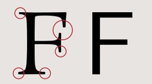
First, a quick explanation of serifs is lines or strokes at the tips of the letter. This is an example of a serif versus sans serif (sans meaning “without” in French), with the left being with serifs and the right without.
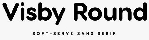
Trend #1 – Rounded Sans Serif
This trend is similar to “Comic Sans,” except the movement is more geometric and professional-looking. Geometric symmetry makes it easy to read and a strong candidate for logos, ads, or brochures. This example shows a more extreme example with large radii on each corner, almost rounding out the entire letter.
https://design.tutsplus.com/articles/what-fonts-are-trending-now-and-font-trends-for-2022–cms-38033
https://design.tutsplus.com/
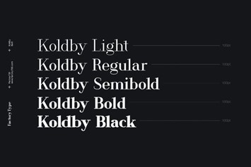
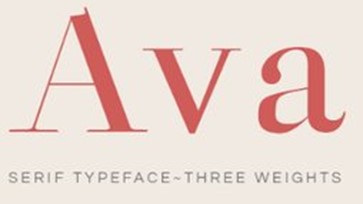
Trend #2 – High-Contrast Serifs
It is a blend of traditional serif types with a modern take. Its classic stylings create an elegant style that could help a name appear older than it is. Contrary to the rounded sans serif, these high-contrast serif fonts have bold bodies and thin serifs.
Trend #3 – Subtlety Quirky
Wes Anderson’s film, released in October 2021, The French Dispatch, is a tribute to journalism set in the mid-19th century. We might see inspiration from a small French town spilling over into 2023 typography trends. Adjectives such as kooky, vintage, and cozy would describe this font well, as there are no complex or set rules. The lack thereof gives it its character, giving it a more bespoke look. We can see some fonts with imperfect sizing and mismatched angles or typewriter-inspired font with serifs that fall into a similar style.
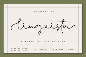
Trend #4 – Fluid and Silky
Venturing from the previous fonts mentioned, this font leans more toward an artistic style. While maintaining its legibility, it could be used more for opulent or grandiose purposes. Following a scriptwriting style such as Arabic is almost like calligraphy. It can be described as being modern with cursive elements to it.
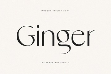
Trend #5 – Pronounced Serifs
This trend leans in on the usage of serifs. Making sure they are seen without a doubt. It uses serifs traditionally yet in a manner to make it modern. Inspired by European cafe signage, they help bring a sign to life without looking old or outdated. The serifs are robust, making them give off a strong presence.
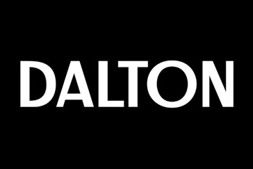
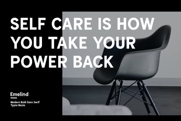
Trend #6 – Strong Sans Serif
Almost on the opposite spectrum is the strong sans-serif font. This font is virtually classic because there are no thrills or frills. It gets directly to the point, making it extremely useful for headlines or layouts that need to get straight to the point. Also, it is best used with contrasting colors, such as the white font on a black background, to make an even stronger statement.
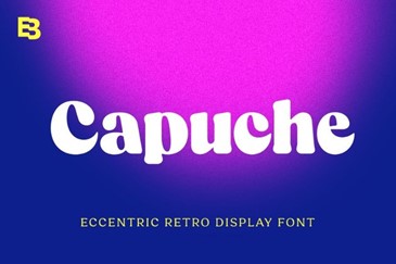
Trend #7 – Chunky Retro
With the ongoing pandemic, people are turning to classics, and retros for familiarity and comfort are rising. Rounding out the trends of 2022 would be a chunky retro. This font doesn’t aim to be elegant, stylish, or futuristic but is strongly influenced by the 1970s. While it may seem tacky or outdated, the trend is to have affected fonts or have a touch of retro. Having it big and bold has to make a statement. Whether used for logos, signs, or packaging, it is one we are most familiar with.
Power of Typography
Typography can easily be overlooked as a reason to make or break your website, brochure, or any platform it uses. It is essential because it is the primary way of communicating with the viewer. The fonts used directly correlate to the look and feel, which leads to the message it is trying to say. For example, messy and mismatched fonts can make the website look unprofessional. At the same time, the correct typography will come across as polished and presentable and, in turn, help build trust in the audience.
Examples are that fonts with serifs come off as established, formal, or stable. Meanwhile, script styles can give an expressive, fun, creative vibe. On a deeper level, typography can even strike emotion. It varies per person as each person’s personal and past experiences affect that.
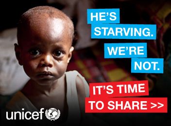
In an ad, striking an emotion in the viewer is an effective way to persuade them. This is particularly useful when thinking about advertisements. Take, for example, this advertisement from UNICEF. Along with a sad photo of a younger boy, the font is big and bold, offset by a bright background. This calls strong attention to the words to give a sense of urgency and alertness.
On the other hand, this advertisement from Aquafina shows off a more relaxed, fun, and joyful emotion. The people’s playfulness in the picture, but the font resembles calligraphy. This gives the entire advertisement a more natural feel and goes hand in hand with the sky-blue color of the words.
Different Uses of Typography
Graphic Design
Typography has since shifted from mainly being read on a PC to mobile devices in graphic design. According to this article from w3-lab, “traffic on mobile devices went up by 222% in the last five years, and in February 2019, 48% web page views were done from mobile devices”. It is recommended not to go below 16px font when designing mobile devices. Readability would be compromised if it were to go any smaller than that. Although I did not touch too much on colors, a website will check if the color scheme chosen passes a contrast test. Having too similar background to foreground color will likely show that it fails the test as it is difficult to read the text.
In general, moving from desktop to mobile complicates yet simplifies. Being mobile means a smaller screen; therefore, space is limited. Having too many different fonts on a smaller screen quickly becomes confusing, so sticking to two, either serif or sans serif, is recommended. This isn’t to rule out fonts with artistic flair, but having too much of it will quickly make readability a hassle. Arial, Courier New, Georgia, Tahoma, Times New Roman, Trebuchet MS, and Verdana are widely used and accepted standard fonts.
In the Real World
One trend we can see physically is new homes being built. Often, we’ll see the address on the house with sans serif numbers giving it a more modernistic appearance. This, in turn, could even affect the pricing of the home. Another example can be seen in restaurant menus. This menu from Katsu Burger shows that they are more of a lowkey, relaxed restaurant. The typography used is less perfect, as though it were handwritten. On the opposite end, the menu for Canlis uses straightforward, sans-serif typography. This gives it a more polished and professional look that matches its upscale intentions.
Future of Typography
A variable font is one example of where typography is moving. This allows font sizes to shrink, grow and be more dynamic. Also, fonts are used in CSS to control their bold, italicized, width, and weight, and not until recently has variable font been more widely used.
The future also holds new designs and fonts that have yet to be explored. For example, this one called, Crackly explores the idea of creating more of a geometric design than it does actual letters. We are also seeing inspirationally driven fonts. This one, Martin, was designed by a black designer and named after Martin Luther King Jr. It is also inspired by the posters used during the protests, which tie it all back together. Finally, it is no surprise that we live in an age where almost everyone is constantly on their devices, and our attention span has shortened. This leads to the idea of “kinetic typography.” As the name states, this uses typography that is kinetic and moving. Giving it motion and life captivates the viewers’ attention.
Whether developing a website or an SEO expert applying specific fonts to the H tags during search engine optimization, it seems that it has become more and more challenging to compete for people’s attentiveness and curiosity. Using specific typography in the correct setting is the best way to maximize its usage while maintaining relevancy. Specific trends may be significant but can be short-lived. Hence designing and using typography for the long haul should be the primary goal.