Rounded Corners
Rounded Corners play a crucial role alongside typography and fluid designs, and benefits are paramount when incorporated on web pages. Creating a website with a user-friendly interface is complex. It can be complicated knowing where to start. Hence, many end up with a website that they are unhappy with.
Does this resonate with you? If so, you came to the right place! The answer to your woes is to put in place rounded corners.
If you use Google as your search engine, you may have noticed that many features are rounded. For instance, we can see that Google’s search bar has round corners. Google’s interface achieves a user-friendly and better-looking interface by implementing rounded corners.
Want to accomplish the same outcome? Continue reading about the website benefits incurred by using rounded corners!
This blog will first cover what precisely curved corners are. Then we will dive deep into the science behind their benefits. We will also discuss examples of well-known brands using them and their history. When you finish reading, you will know when to use and avoid them.
What Are Rounded Corners?
Rounded corners are simply the process of rounding out the edges of features within a website, such as cards. This is often used to add aesthetic appeal and usability. To attain this appearance, one must be familiar with CSS since it requires the CSS property border-radius property.
Border-radius allows you to alter the radius of elements within your website. You can do it collectively by using a border radius or targeting specific corners.
For instance, you can use the border-bottom right radius property to only control the bottom right corner. You can also do the same for the top corners. The property for this is border top left radius or border-top right radius.
This powerful tool can either add or reduce websites’ aesthetic appeal or usability.
History of Rounded Corners
Does the name Bill Atkinson ring a bell to you? It should. But if not, let me give you a quick rundown. Bill Atkinson was an Apple developer and worked closely with Steve Jobs.
Atkinson was responsible for a code that allowed circles to be drawn faster on Lisa Graf. This was revolutionary, considering the difficulty involved with drawing circles on Macintosh. But despite the impressiveness of his code, Jobs still had some comments.
Request a Quote :
ref: Folklore
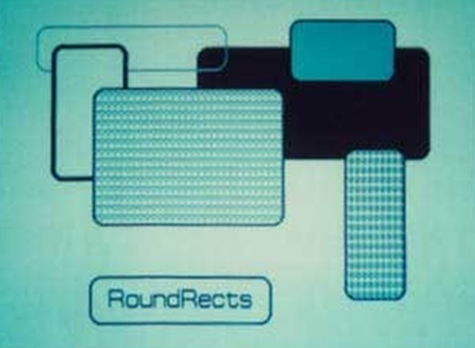
Steve Jobs proposed an idea to Bill Atkinson to create rectangles with rounded corners. At first, Atkinson was hesitant due to the foreseeable challenges and thought it was redundant.
But after some convincing from Jobs, Atkinson eventually gave in. Thanks to Atkinson and Jobs, Round Rects became a thing. The rectangles with rounded corners that we know so well today!
Science Behind Their Benefits
It is common knowledge that people are attracted to beautiful things. So why not use this knowledge when it comes to your website?
Rounded corners can be the missing puzzle to your website. Don’t believe me? Here are some scientifically-backed reasons why round is better.
Implementing a more rounded appearance to your website improves its reputation. The shape of elements in your website can influence how others perceive it.
For instance, rounded objects are associated with friendliness. In contrast, sharper objects are associated with aggressiveness or dependability. You may be asking why that is. This is because of the effect known as Bouba/Kiki.
Softer Edges
Below is an image of two shapes. To test out the Bouba/Kiki effect, try assigning “Kiki” or “Bouba” to the two shapes. Most people would give the word Kiki to the left figure and Bouba to the correct figure. This is an example of the Bouba/Kiki effect.

Ref: Wikipedia
In short, this effect explains that humans often ascribe certain characteristics to specific shapes, words, and sounds. This means that having softer edges can influence how your business website will be perceived. Thus, curved corners are worth considering as they can add a more welcoming “look.”
Another reason for softer edges is that humans are biased toward rounder objects. A research report found that participants preferred curved or mixed objects (sharp and round) over sharp ones.
A working reason for this outcome is due to evolutionary theory. Sharper objects are attributed with danger, while rounder objects are not. Of course, sharp objects like needles will be less preferred over pillows. However, in the research, safer things like watches were preferred less if they had sharp angles.
Brain Activity & Rounded Corners
The same researchers performed another study but used an fMRI this time. The fMRI allowed them to monitor the Amygdala’s activity when participants were given sharp objects.
Note that the Amygdala is part of your brain connected with emotions such as anger, fear, etc. And fMRI are brain scans. They discovered that more action appeared in the Amygdala when given sharper objects. This affirms that sharp objects are associated with threats.
What this tells us is that shape can influence human behaviors and perceptions. Although the form of a corner may seem insignificant, it can have unconscious effects on website visitors. Thus, affecting how they interact with and view your website.
Moreover, rounder shapes are typically easier for the eyes and brain to process. One reason why is it appears less bright. Corners with sharper contours were more brutal due to perceived luminance. This means processing elements with too many sharp corners may take more cognitive effort.
In summary, it is good to have an even balance between sharp and round, as too many sharp angles can make the content of your website hard for users to navigate. This often leads to user-experience issues.
Famous Brand Using Rounded Corners
Ref: John D. Cook
Big brands know the importance of shapes and their impact on users. Brands such as Apple, Spotify, and Google are fantastic examples of this. Perhaps, their more rounded design approach is one of the reasons why they are successful.
The brand that had the most success in this web design interface is Apple. Everything from Apple’s logo to their physical products is rounded. It is almost uncommon to see any angular or sharp corners from Apple.
One notable example of them using rounded corners is their apps. Looking at their app icons, you can see it takes a squircle appearance. But what makes Apple’s icons different is that their rounded corners are continuous.
This means that the combination of round and square looks more seamless to the point that it looks like its own shape. So, when considering using a more rounded look with your website, this might be worth considering. Nevertheless, Apple achieves a more approachable and cleaner look because of this.
Spotify is also an excellent representative of the usage of softer edges. Like apple, they make effective use of circles within their interface. If you have ever used Spotify, you most likely have noticed their apparent green buttons. Their green buttons stand out like a sore thumb.

Ref: Naomi Bendet
You may have attributed that to the apparent contrast between green and black. However, the shape also plays a role in helping it stand out. Very rounded buttons with fewer sharp objects can make things more noticeable. Thus, Spotify’s technique can help you create something that stands out on your website.
Google Branding With Rounded Corners
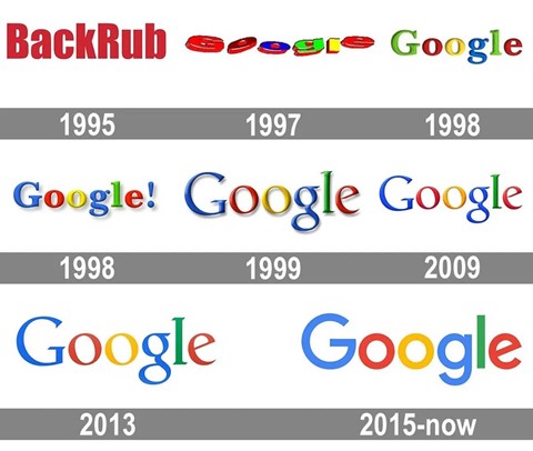
Ref: https://1000logos.net/google-logo/
Google is another brand that enforces softer edges within its platform. Other than their search bar, we can see that their logo is designed circularly. As mentioned, doing so can create a more positive demeanor for Google’s presence. If you compare previous versions of Google’s logo, which one do you deem more friendly?
Probably the more recent one. Not to mention, this newer logo gives a more modernized look.
Coming back to the kiki/bouba effect, the word Google is like “Bouba.” Both words and the shape of the letter appear more rounded. This gives a friendlier presence.
So, when thinking about your website, think about the fonts you use. Your website font shape can also affect perception.
When To Use Rounded Corners
The first step in using rounded corners is to know your brand. Knowing your brand could help you see how far you can go with this design.
For instance, websites with a younger audience would benefit more from rounded corners. This allows for a friendlier presence. In contrast, traditional brands would benefit from both sharp and rounded edges. Also, it ensures a balance between professionalism and credibility.
However, there are instances where rounded corners should be universally used.
Roundness works well with call-to-action buttons and text boxes. This is because it helps direct our focus on the interior of the button. In contrast, sharper edges distract our attention from the content since its corners point outwards. Thus, if you want users to focus on the content, try surrounding it with a squirrel container.
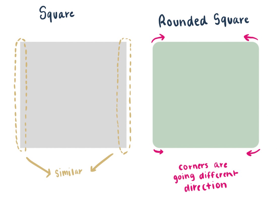
Another way to use curved corners is with grids. Using them with grids can be a terrific way to save space and provide an approachable look. Not to mention, grids with more curved corners are more indistinguishable than round ones.
For instance, more rectangular-shaped boxes have parallel sides. The image below shows that the top left corner is the same as the right. This is the same with the bottom left corner.
On the other hand, curved boxes’ sides are less identical. The figure below shows the top left and curved bottom corners going in different directions.
When To Not Use Them
Although many benefits come with round corners, there are situations where it is best to avoid them. In some cases, rounded buttons can be confused with tags. This can have significant user interface issues as your customers might misinterpret the purpose of your buttons. Thus, it would be best to deliberate where you place your buttons and how you style them.
Another downside is that it can make your website more complicated to use. If you are trying to add a dropdown menu in a fully rounded button, there’s typically less region for the user to click. In this case, using fewer curved buttons with dropdown menus is best.
The last thing to consider is to know when it is appropriate to use rounded corners. There are situations where you would not want to have an approachable appearance. Instances such as warning messages would work better with sharp corners.
Takeaway on Rounded Corners
Although round corners may sound inconsequential initially, it has a massive role in your website development’s success. It can influence many essential areas of your website.
Areas such as your website’s reputation, usability, aesthetic appeal, and many more are affected by curved corners. Thus, it is crucial to know when and where to use them. And that is what this blog aimed to do.
After reading this blog, I hope it gives you enough motivation to implement it on your website. The insignificant details are what make up the bigger picture.