Fluid/Organic Web Design and Elements
Why Fluid/Organic Design and Elements are Important.
What Fluid/Organic Design and Elements Look Like
Fluid/Organic Design and web design elements are recent design trends in website development. It utilizes rounder shapes and more natural, fluid patterns instead of sharper, more geometric shapes and edges. These softer shapes make businesses look more approachable and friendly, and this is due to shape language.
Shape language is used in media and art, and these shapes can help in what the artist is trying to portray. For example, in Disney’s Up, Russel, one of the main characters, uses shape language. Russel is friendly and outgoing, and to go along with his personality, he has a round silhouette. Using a circle silhouette makes the character seem fun and approachable.
What Makes Fluid/Organic Design Appealing
People always appreciate a website that is more interactive. It’s also appealing because the shapes are simpler and more minimal, making interfaces look clean. With fluid/organic design and elements in mind, it is easier to create animations using shapes, which helps make a more enjoyable user experience.
For example, this interactivity can be created through animations or swiping to access a specific part of the web page. This makes the website experience much less passive and encourages the user to explore the website and investigate what else the rest of the website has to offer.
Many businesses, websites, and social media use rounded edges and minimalism. This, along with fluid/organic design and elements, allows the viewer to focus on what is being shown on the website. By not overwhelming the user, the user can explore the website calmly and focus on the brand itself.
Request a Quote :
What Elements Are Considered Part of Fluid/Organic Design
Fluid/organic design and elements don’t use rigid shapes. Instead, it uses softer, rounder shapes often accented by vibrant website colors. Glass morphism is a part of fluid/organic design. Glass morphism is often used in the background, creating a “frosted glass” effect.
Usually, glass morphism is used with a colorful background. The glass effect will not be visible if the background is only one tone.
Another thing to consider while using glass morphism is to create a border. Adding a thin, white border simulates the glass edge and can help it pop out from the background a bit. Without a border, it may be hard to determine where the glass morphism element ends.
Below is an example of an app that appropriately uses glass morphism and fluid/organic design. Please note how it adds the white edge onto the glass morphism elements. It also uses rounded edges, even in the icons below, and the font has no sharp edges, so it helps to keep it soft.

Ref: Glassmorphism in user interfaces
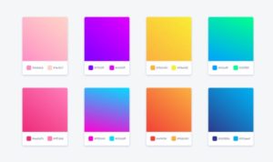
Gradients
Modern gradients tend to use softer colors and limit themselves to two colors. Gradients and colorful backgrounds are also a part of fluid/organic design. However, it’s essential to recognize how to implement them. If done incorrectly, the website ends up looking tacky instead of modern.
While making gradients, it is important to stray away from using neon and too many colors. When looking at a color wheel, it is best not to choose colors on opposite ends. It may be harder to mix these two colors.
To find some good color combinations, try looking online for inspiration. Many color combinations are proven to work online, and nature can also be a great way to find color combinations.
This can be through sunsets, the night sky, the color palette of a forest, and more. In forests, there are earthy tones like green and brown. On sunsets, there are tan and orange colors.
Simplicity
https://looka.com/blog/gradient-logo-design-guide/
Overall, the fluid/organic design is great for simplicity and for making the website look more welcoming. There are instances in which these visual elements are best used. Many websites have updated their layout to represent the latest design trends better. If you want your website to have a modern touch, then maybe it is time to consider utilizing fluid/organic design.
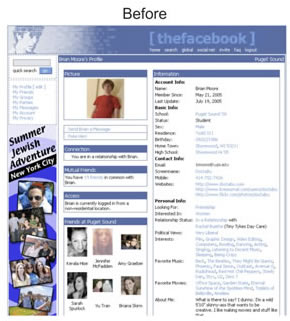
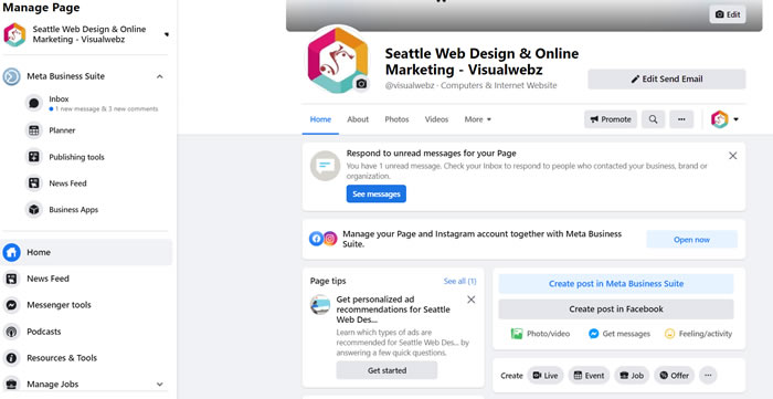
Below is an example of Facebook and its website before, around the early 2000s, and their website now. The edges on the older interface were sharp, while the new interface had rounded edges. Their website now utilizes many elements found in fluid/organic design.
Less Clutter
Overall, the new website is less cluttered, making the user less overwhelmed. Facebook has a simpler logo, the letter ‘F’ behind a blue gradient. There’s even glass morphism used in the new website, which is the plus sign at the top of the “Add to Story” section.
Looking at both versions of the website, it’s clear that the design trends show how Facebook, over time, changed its website to fit the design trends. As a company, they need their website to stay up to date to maintain that professional quality and continue their website as a website that their users enjoy.
Maintenance
It is important to continue maintaining a website and making small design changes. Companies must know the design trends or fall behind other websites. Looking at how their website looked before and now, the website after is much more appealing, and it better conforms to the current design trends.
Looking at all these modern websites that use fluid/organic design, making your website stand out can be challenging. Sometimes, all the websites using fluid/organic design elements look the same. Experimental typography can be a great way to utilize fluid/organic design without making a website look uniform. The type of font you use to build your website can significantly help the image you are trying to get across.
Minimalism
For example, at https://jessbayer.com/, Bayer’s website is very minimalistic. To contrast this, she uses a bold font for her title. Her website looks professional with a minimalistic design and an elegant font look.
These typography-led websites usually reduce imagery altogether and allow the font to carry the weight of its first impression. Instead of coming off as bare, they are bold in their simplicity. They’re also great for showcasing the different types of fonts there are. These websites are not afraid to stray away from the typical Arial font.
There are certainly benefits to implementing fluid/organic design. It makes your website look approachable. Also, since it’s a design trend, your website looks modern. Minimalism and fluid/organic design go hand in hand, and making the user interface simpler will help.
For example, when web developers add many options for the user, they expect the user to feel satisfied with the number of options. Instead, users end up overwhelmed by the number of options, so it’s best to keep it simple.
How Fluid/Organic Design Can be Done Incorrectly
Knowing that someone can try using fluid/organic design elements and still not achieve their goals is essential. For example, if the individual decides to make a typography-led website, they need to have the font they’re using in mind.
If they’re using a font that pops out and is very vibrant, they should only use that font for their headings and not for the paragraphs they plan to write. Using a bold font all over the website makes it lose its charm.
In design, the elements of the website cannot clash. Asking for feedback can be a great way to determine whether your website’s creation looks pleasing or not.
How to Create a Website Using Fluid/Organic Design and Elements
Considering this, how can someone create a website using fluid/organic design and elements? Look up some inspiration.
Look at what modern websites have been making. Take elements from their designs and incorporate them into your website. A great place to find these websites is https://bestwebsite.gallery/ which shows a gallery of professional websites.
https://commercecream.com/ is also a great place to look for inspiration. One helpful feature it offers is showing the other works of agencies that designed a website you liked. This can help you find even more design inspiration that you are more likely to appreciate instead of looking around for design inspiration and only ending up with designs that don’t fit what you are looking for.
Where to Look
There are some things to look out for when you make your website. Agency websites are great to look at, even if the website you plan to make isn’t an agency. These websites tend to attract great web designers, so looking at these websites can be an excellent source of inspiration.
Color inspiration can also be found. Look at a website’s color theme, and see what you like about it. The colors that a website uses help represent the website’s message and its target audience.
For example, many websites like Google Docs and Canvas have a black, gray, white, and blue color scheme. Keeping the colors to a minimum ensures these websites have an air of professionalism. If the color scheme is too vivid, it may distract the user from doing their job. This makes sense since Google Docs and Canvas are websites where someone would do their work.
Bright and bold color schemes are used to grab the user’s attention. Dark themes evoke feelings of mystery or luxury. The bright tones feel refreshing and fun, inviting the user to check out the website. Other typical color schemes are found that help to represent a website.
Monochrome websites also make quite a statement, like bright and bold color schemes. Creating a website using only one color can be tricky without making it seem visually dull, so successfully making a monochrome website is impressive.
Takeaway
It’s essential to keep the design trends in mind. Using design trends will help make your website look modern and prevent you from having the worst website on the block! But that doesn’t mean you have to follow it to a tee. Taking some creative liberties can be what helps your website stand out.