Diversity in Web Design
A Guide to Diversity in Web Design
What is diversity in web design?
Web design is planning, arranging, and creating content for a website. Diversity includes people from different abilities, racial backgrounds, genders, ages, classes, etc.
The internet is for everyone! It’s essential to make sure everyone can understand your content. And one thing we as web designers consider is their audience. Don’t limit your audience by not considering how different people will view your website.
Why is diversity important?
More than 15% of the world’s population lives with a disability. That’s a lot of people who may visit your website. Think about it, most of the world is different from you. Hence, excluding people isn’t a good strategy for expanding your audience. Visitors to your website must feel welcome and included, especially when you think of abilities and perspectives different from your own. Hence, why do qualified web designers and marketers always consider this when designing a website and planning the content?
The Americans with Disabilities Act became law in the US in 1990. It protects people with disabilities from discrimination. Because of this law, websites in the US must be accessible. Many countries have similar laws. According to NPR, more than 181 countries have passed laws inspired by the ADA. This shows accessibility is essential worldwide.
Request a Quote :
Web Content Accessibility Guidelines
The World Wide Web Consortium has Web Content Accessibility Guidelines (W.C.A.G.) that set international standards for accessibility. Their guidelines have four principles: perceivable, operable, understandable, and robust.
- Perceivable: Users must perceive your website’s information and user interface.
- Operable: Your site’s user interface and navigation must be operable.
- Understandable: Your information and user interface must be easy to understand.
- Robust: Your website must continue to work as disability technology evolves.
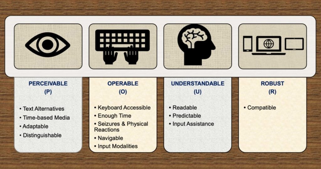
P.O.U.R. Principles
1. Website Perception
Many disabilities affect how a user perceives a website. Colorblind users will see your website differently than a user with full-color vision. There are many types of colorblindness: deuteranopia, protanopia, and tritanopia.
To help users distinguish your content by color, choose colors that don’t conflict with others in your color scheme. It’s also essential to ensure high contrast between your background color and text. The small text needs a higher contrast ratio than the large text. A sharp contrast makes the text easy to read.
Adobe’s Color Accessibility Tools help you see your color scheme as people with those disabilities would. Use the tools to ensure colorblind and low-vision visitors can still understand your content.
Blind users will likely use a screen reader to access your website. This means any non-text content needs to have text alternatives. For example, all images must have alt text that accurately describes the content. Similarly, all videos need captions. All text needs to be understandable and readable.
Summary:
To be perceivable, the interface and its content must be shown to a user to understand. Information that is not delivered in an easily understood way is inaccessible.
This includes giving text to individuals who cannot hear and audio to individuals who cannot see. It does not mean that all text should be read aloud. The information should be readable by screen readers and other assistive technologies.
Ask: Is there anything on the page that a user who is blind, deaf, has limited vision, or is colorblind would find hard to see?
2. User Interfaces and Operation
Your website should be easy to navigate and operate. Usabilitygeek recommends your website be simple enough to navigate by keyboard alone. Screen reader users must be able to perform all interactions on your website.
All form elements must have labels. This ensures forms are easy to fill out with assistive technology. Also, interactive features need to give feedback. Confirm form submissions and alert the user to any errors. When a user makes a mistake, provide a clear explanation and suggest a fix.
Provide more than one way to navigate your site. Include a navigation bar, a search bar, and a site map. Breadcrumbs can also be helpful. Breadcrumbs provide a trail back to the user’s entry point. Also, breadcrumbs can be based on history, attributes, or location in the website’s hierarchy. For example, a shoe shopping web page might have prominent> women’s> sandals > high heels breadcrumbs. Each word would be a link back to the relevant page.
Summary:
When accessing the internet, not everyone uses the traditional keyboard and mouse. Some persons use adaptive devices or alternative technologies to accommodate disabilities or preferences. No matter an individual’s input device, all functions must be functional, especially those connected to navigation or dynamic elements.
Imagine a student who has undergone surgery on their hand or arm and cannot use a mouse. This student now must use a keyboard to navigate, and your website should offer keyboard navigation in each drop-down menu.
Ask: Is it possible to use a keyboard to execute all the features on our website? Can the users control the website’s interactive parts? Is it simple to do things on the website?
3. Accessibility and SEO
Best practices for accessibility will help your search engine ranking. Google has a Lighthouse tool to help web developers improve a website’s quality. One of the key metrics is accessibility. When Google tells you how they rate a website, you should listen! Accessibility also improves your SEO score.
Meaningful page titles improve SEO and accessibility. A meaningful title allows users to understand a website’s purpose without visiting it. Search engines display each website’s title on their search results pages. Screen readers will read the page title first. Make sure users know they’re on the right page.
Lists help users and search engines understand your content. Screen readers will tell users that there is a list and how many items are in it. Search engines see a list in your content and know that lists are helpful for some searches.
Link text should be short, relevant, and essential. Descriptive links help users understand a link’s purpose before clicking. For example, text help has a good SEO and web accessibility overview. This shows search engines what a site is about.
Summary:
Users may perceive and use a website, but this does not mean they fully understand it. The link between the action and the outcome should be clear when a user acts. Websites that are easy to understand use simple, straightforward language and provide simple functionality.
The navigation on a website should be the same throughout it. The formed flow should be clear, and the labels should be evident. If a user must complete a process, sufficient instructions should be provided. Useable websites are automatically more accessible. This is referred to as usability rather than accessibility.
Ask: Is all the content on the website presented straightforwardly? Is it simple to grasp all of the interactions?
4. Racial Diversity in Design
The United States is a diverse country with a complicated history of discrimination. People can discriminate by ethnicity, gender, age, or class.
According to Zippia’s demographic estimates, 66.1% of U.S. web designers are men. 49.5% of the U.S. population is men, according to Wikipedia’s article on U.S. demographics.
The most common ethnicity is White at 64.5% of designers and Asian at 15.4%. But White people are 61.6% of the entire U.S. population. Asian people are only 6.2%. That means these two ethnicities are overrepresented in web design.
In contrast, 5.9% of U.S. designers are Black or African American. 12.4% of the entire U.S. population is Black or African American. They are underrepresented in web design.
Summary:
Your website must be capable of supporting and being accessed on a wide range of devices, including assistive technology. Even as technology and user agents advance, content must remain accessible and interpretable.
Validators for HTML have been around for a long time. Robust is perhaps the most machine verifiable of all the POUR concepts. Many automated accessibility solutions are also available. Of course, since machines do not grasp semantics, they cannot decide whether a specific element should have been utilized. They can only verify the accuracy of what they see with their own eyes.
Ask: Can the website only work with the most recent browsers and operating systems? Is the website built according to the best standards?
How does representation affect design?
The main goal of diversity and accessibility in web design is to create content that everyone can understand. A diverse group with dissimilar backgrounds will have different ideas. Working with a diverse group can help ensure your content is easy to understand. In an interview about the Black Experience in Graphic Design,
Bobby C. Martin Jr. says, “Better representation means better communication, which means information is more equitably shared — and knowledge is power.”
How can I improve diversity in the industry?
Bronwen Rees on UX Planet has suggestions for improving diversity in the design industry.
- Look for new hires outside of your family and friends. This will help you find candidates with different opinions and processes than yours.
- Become a professional mentor to someone with a different background. You will learn how someone else thinks and help them achieve their career goals.
- Have flexible work-life policies. This will let you hire people who can’t maintain a strict 9-5 schedule. Single parents and disabled people could benefit from flexible policies.
- Stand up against discrimination in the workplace. Challenge discriminatory assumptions and attitudes. Say something!
- Seek feedback from diverse user groups. You’ll get unique insights you wouldn’t notice alone.
Guiding Principles for Diverse Content
Web designers need to think outside of their box to design for everyone. Another Lens has three guiding principles and many questions to ask yourself as you create your website.
- Balance your bias. Ask yourself, “Am I challenging my assumptions?”
- Consider the opposite. “What if I’m wrong? How can I tell? Who would disagree?”
- Embrace a growth mindset. “Can I convince my audience to change their minds?”
Your website will be accessible to everyone by designing with diversity in mind. You must consider other people’s viewpoints and be open to user feedback. Make sure you consider these guiding principles before posting.
Five ways to improve accessibility
Check the color contrast on your website.
About 2.2 billion people have moderate to severe vision impairment. Many of us would not think twice about looking at a block of writing on different color backgrounds. Texts lacking contrast from experience can be a headache to read. Making your website, WCAG 2.0 compliant will make their lives easier and help them engage with your site more freely.
Color Safe is a handy tool for choosing a color palette accessible for your work. You may also use WebAIM’s Color Contrast Checker to evaluate your previously selected colors. According to the W.C.A.G., the smallest contrast ratio between some text and its background should be 4.5 to 1. For bigger fonts, the ratio drops to 3 to 1, starting at 18pt for 14pt bold.
When displaying valuable information, do not rely on color.
Color is a powerful visual tool in both the actual and digital worlds. It adds presence, conveys attitude, and aids in information separation. Color has design advantages, but it can be inefficient when sharing information.
Never use color as the only visual signal for displaying crucial information. Color differences alone can be hard to distinguish for someone with color blindness. When presenting data to others, use an indicator other than colors, such as text labels or patterns.
Make your typography accessible.
You might feel that a text size of twelve is suitable for your website’s readers. Yet, the readers may disagree. Users might struggle to read such writing and leave your site without returning. As a result, keep in mind that users should always choose the font size. It will make reading a far more pleasurable experience.
For people with disabilities, specific font sizes and styling can be troublesome. Screen readers, for example, frequently neglect stylistic methods like strong and italics, rendering these styles worthless for blind users. If the writing is too small, individuals with limited vision or color blindness might not see it, while others may struggle to understand the italic typeface.
Use alternative text for images and non-text content
Alternative text allows users who cannot view pictures to get information. It helps people read aloud with assistive technology such as text-to-speech, speech input software, and websites that support the speech feature.
The alternative text provides the image’s description if a picture cannot be seen. It is a text-based method of describing vital, helpful information about an image. Because it lends more meaning to the text nearby, it gives our viewers another technique to perceive the image.
Create usable focus states.
Focus states are essential for ensuring that the user interface can be navigated without using a mouse and providing a positive experience for every user. People can browse and engage with a website using a focus state utilizing a keyboard, voice-activated software, or technology. Most web designers and developers often overlook focus states, which shows that a sizable chunk of the population has a negative experience interacting with these user interfaces.
Takeaway
In web design, diversity is often a challenge for designers. However, it also presents a chance to create better solutions. We can bring new insights, perspectives, and a more comprehensive range of filters to the table. By recognizing these challenges and working with diversity, the industry could evolve past its old ways.
This new mindset can impact a new age of acceptance and produce more creative solutions for our products and services. The most important part of diversity and inclusion is eliminating laziness and ignorance. We can create a better, more inclusive society if we work together.